I was going through the drawers in my office recently and happened across an old sketch book of mine. I used to do a lot of sketching of ideas, working things out by drawing the details before they actually became a reality. I would always carry a sketch book with me where ever I went so I could quickly capture my inspiration as it occurred. I haven't been doing enough of that lately with the advent of Auto Cad, a program where drawings are computer generated, and with my small digital camera in my purse at all times. I don't know whether it is laziness or the advent of technology, but I must say that looking back on these quick hand done sketches they have a certain charm that the computer or the digital camera just can't achieve. There is something to be said for hand drawing. When I went to Design School we were taught to hand draw and I filled copious sketch pads. When I studied Architecture in Paris and we would sit for hours in front of an important building or monument while the professor talked about the merits of the architecture and we would be fastidiously sketching away. I remember my first art class where there were nude models. I was very young and very naive and must say that it was very embarrassing for me to learn to draw the human body anatomically correct. Hand drawing is a very good way eye to train the eye to see details, and details are the stuff that design is made of. There is something magical about capturing the essence of something with a few lines.

Interior Design Sketches Drapery & Trim

Interior Design Sketches Fabric & Trim
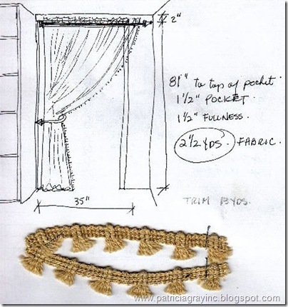
A sketch for a doorway into a Master Bedroom closet. I played around with different fringes to edge the drapery. One side was striped and the other side was a coordinating floral in linen.

Interior Design Sketches Drapery Tie Back Detail
This was an alternate detail for the drapery to cover the doorway into the Master Closet. Instead of being held back with a piece of curved metal it gathered back on itself with a series of loops sewn onto the back of the fabric, much like a roman blind. The top of the drapery was hung over the curtain rod with tabs that folded over and were pointed on the ends. There is even a design for coordinated lampshades trimmed with cord and tassel.

Interior Design Sketches Cushion Details
These were sketches for toss cushions with notations for the size,fabric, trims and even the colors.

A sketch for the drapery workroom for a "balloon" valance treatment with a decorative French mirror between. The windows bothered me as they were not even, so I added full length side panels to each window, as noted in the bottom notation, to have 10" hems/headers and I wanted them to puddle on the floor so I added an extra 40" to the over all length. I would not have been able to make this decision to frame the windows with full length draperies as easily if I had not done a sketch first.

Interior Design Sketches Cushion Details
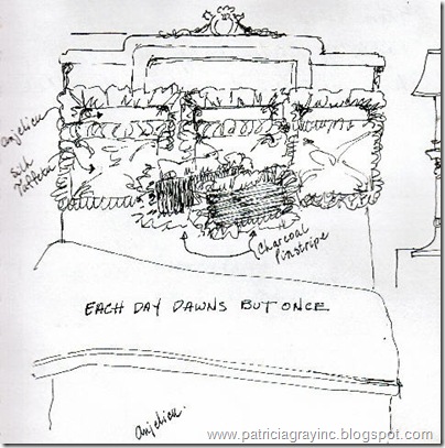
A sketch for the arrangement of toss cushions and bedding, that were made of 3 fabrics: Cream Silk Taffeta, Anjelica - a beautiful cream and navy linen toile, and a charcoal pin strip Egyptian cotton. Funny I even added a little quotation: "Each Day Dawns But Once".

Interior Design Sketches London Chair Details
A sketch I did of a chair in a Hotel Lobby in London, that intrigued me. I was sitting down waiting for the check-in to happen. The British do wonderful detailing on their upholstery and drapery treatments. I remember being so totally charmed with the fabric and color selection of this chair that I had to note exactly how it was done. I even drew the skirt in detail with a section through it. People must have thought I was crazy, as I lifted up the skirt several times to see exactly how they had sewn it. I carry a travel palette of watercolors and use whatever liquid I could find, this one might have been painted with tea?? After all it was London.
PATRICIA GRAY INC is an award winning interior design firm writing about lifestyle and
WHAT'S HOT in the world of interior design, architecture, art and travel.
2011 © Patricia Gray | Interior Design Blog™